LN_RB01
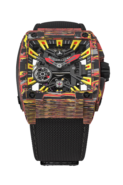
Rebellion x LN - RE-VOLT
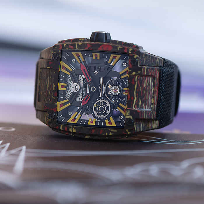
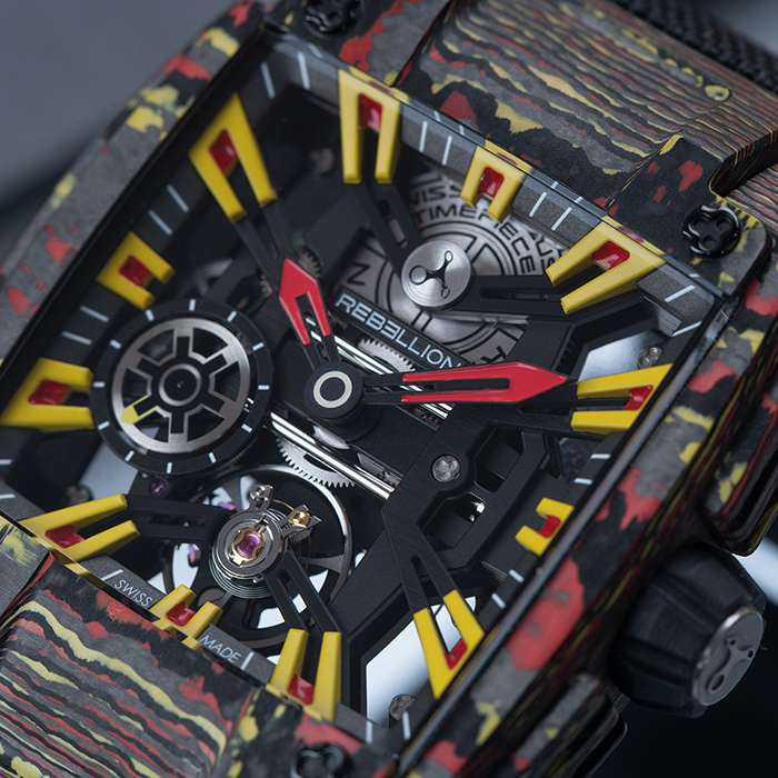
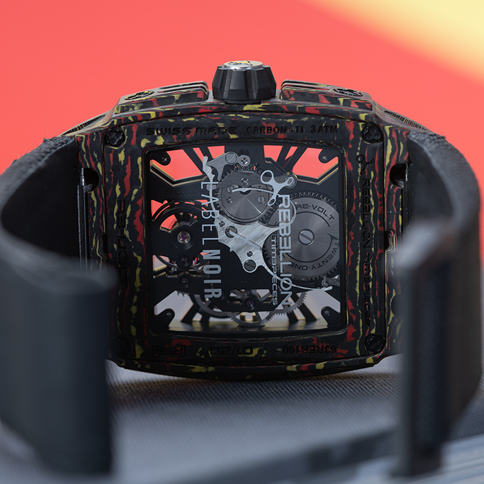
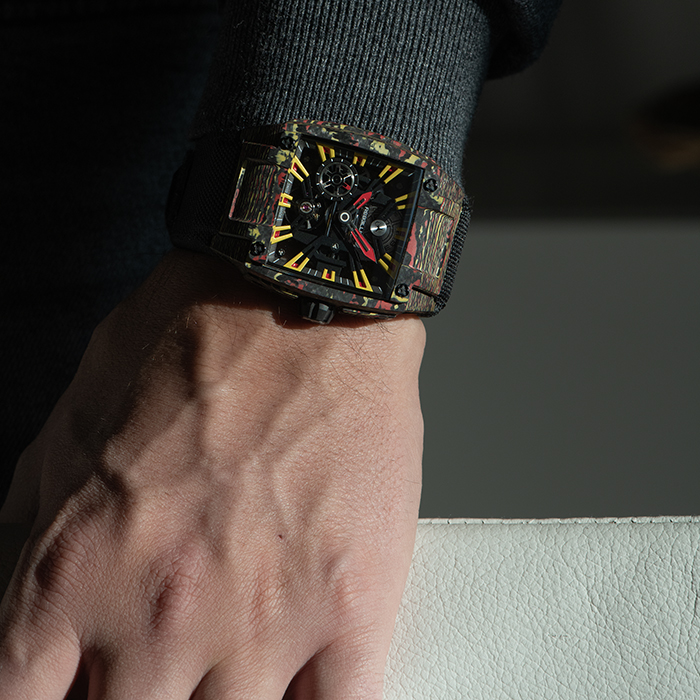
Clash of colors, power of know-how. Here is the whole spirit of Rebellion and Label Noir's collaboration. It' the matchup of two minds, two personalization virtuosi. The outcome is unexpected, as rich as a sharing of exoticism, as if two cultures were dancing around a fire. Rebellion's emblematic sporty piece becomes warm, exotic. Label Noir's signature minimalism moves it into a festive, heady, full-on painting, like a Macau night.
PRICE 50,000 CHF
Price excluding tax - Free global delivery
Technical information LN_RB01

- BASERE-VOLT 3 HANDS CARBON COLORED
- CALIBERSkeletonized movement
- MATERIALCarbon
- WATER RESISTANT50 m
- SIZE8.5mm x 40.35mm x 13.5mm
- EDITIONlimited edition to 20 pieces
- BEZELCarbon
- SPECIFICATIONSSkeletonized movement
- FREQUENCY4 hertz
- FINITIONColored Carbon
- DIAL
- HANDSSecond Hands at 7 o’clock
PRICE 50,000 CHF
Price excluding tax - Free global delivery
